The hard work of creating elearning content doesn’t stop after you’ve written the last sentence on your final slide or page, unfortunately. How that content is laid out in your presentation, document or course is just as important. The same is true of web design. You can have the best web content but without proper design the content won’t be nearly as effective. Below are eight web design principles that will help keep your elearning design on point.
1. Purpose
Just as in web design, each slide, page, video sequence, etc. should have a specific purpose. One slide may be communicating the importance of wearing goggles while the next is all about the importance of ladder safety.
Likewise, if the purpose of a particular slide is to get the user to take an action, then make sure that desired action comes across loud and clear in the directions, through use of a button, blank type field or something similar.
The user should never be confused about what they should be learning or doing.
2. Communication
It’s no secret that people want information quickly. We don’t always have the luxury of time on our hands so make sure you are communicating your topic clearly and effectively.
Some great ways to do this are by using:
- Headines
- Sub headlines
- Bullet points
- Font styles (bold, italics, underline)
3. Typefaces
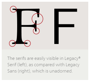
Did you know that the best font type to use on the web is a sans serif font? What does that even mean?
Sans serif fonts don’t have the decorative lines at the edges of their letters, numbers and symbols like serif fonts do. Still not sure what we’re talking about? Here’s an example:
Since most elearning takes place online, pay close attention to your font choice.
And we can’t forget about font size!
Choose a font size that is larger and easy to read. If you are having to use a small font to fit a lot of material on one page then you might want to take another look at your content and see if there’s any unnecessary information you can take out.
4. Colors
Colors can be an easy way to break up information while adding a fun design element to your content.
Some of the best ways to use color are by using the different color families. These are color groupings like complimentary, secondary, contrasting or even your branded colors. However, it’s important to note that you should stick with just one color family (per slide at the very least).
5. White or Negative Space
Colors can be great but even lack of color can be a powerful design element.
You may have heard the term “white space” or “negative space” at some point in your life and this is a key element of good website design. Don’t feel like you need to fill up the entire page. Sometimes, leaving white/negative space creates a bigger impact than a busy page.
6. Images
Remember how in our elearning video tips blog post we mentioned that our brains process visuals information 60,000 times faster than text? That still rings true even in text-based elearning content.
Coupling your text-based information with a strong graphic is a great way to help communicate your learning objectives.
Always make sure you’re using photos you’ve either purchased or have downloaded from any of the free stock photo websites out there. (Note: some of the free stock photo sites require attribution in order to use their free photos)
Some of our favorite free stock photo sites that actually don’t require attribution are Pexels, Pixabay and StockSnap.io.
7. “F” Pattern Design
Have you ever seen a heat map used to track how people’s eyes look at information on websites? Here’s what one looks like:
Can you see the connection between the picture above and this section’s sub headline? It kind of looks like an “f”. That’s because our eyes naturally process information by starting at the top left and reading to the right and down.
Make sure your content works with this “f” pattern and that you include your most important information (such as the topic and maybe a key point) in the top left corner and continue to the right and down.
8. Mobile Friendly
We’re a society that’s constantly on-the-go. Therefore, elearning content needs to align with this constantly moving lifestyle.
There are a number of different ways to make sure your content is mobile ready. One is to create your content via an authoring tool that makes your content responsive. This means the training will resize to the user’s device automatically and in a way that maintains the proper dimensions of your various content elements.
Another way is by creating mobile-specific training that is built for the small screen size of mobile devices. This could be through an app, a mobile site, or using a mobile-specific template from an authoring tool.
If you’re using a learning management system (LMS), make sure that it is mobile-ready as well since this is how you’ll be delivering your content.
Some of these principles may seem like common sense, but it’s easy to forget them once you start trying to fit your content into your course. Incorporating these web design principles into your elearning design won’t only make it better looking and easier for your user’s to comprehend the material, but it also ultimately makes it more effective and you should see higher completion and retention rates.
So when designing your elearning courses, make sure to keep purpose, communication, typefaces, colors, white space, images, layout and mobile friendliness in mind.
Do you have other web design principles that you apply to your elearning design? We’d love to hear about them below!